Loading
The Futur · February 18, 2017
Live Design Critique Main Title Design with Chris Do via Facebook Live

Featured · Guests
Who appeared
Summary
Description
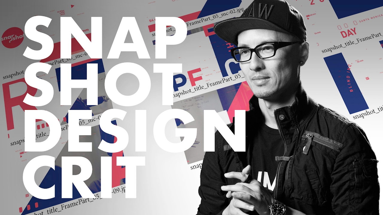
Chris Do gives a live critique and art direction on a spec show title called "Snapshot". He reviews the work of designer Minhye Cho as she explores a variety of logos, design systems, colors, for a new documentary series on design. It's real, raw and unpolished. It's called Snapshot and coming to you soon. Annotations --- 00:04:35 Snapshot v1 - Logo Critique 00:06:20 Q: How do you know which font/typeface to use? 00:07:24 Design for Scale: Test breaking the logo into two lines 00:08:54 Kerning: Solving spacing issues in creative ways 00:11:45 Visual Context - Agfa / Leica Logo 00:13:04 Why we are making Snapshot 00:16:18 How Graphic design differs from broadcast design and motion graphics 00:17:14 Snapshot v2 - Logo Critique 00:19:58 Increasing Density: Make your logo work within a one-half by one-half inch square. 00:22:36 Story Board - Critique 00:27:54 Q: Would hand-sketching be a better method to experiment with title design? 00:30:55 In order to solve something, you have to know what the solution looks like. 00:33:50 Supercomps vol 1 - Overview 00:41:15 Q: What are the dimensions of this Supercomp / how large? 00:43:17 Creating multiple sequence frames from a Supercomp 00:45:20 How to turn bad client color choices into great design. 00:48:15 Rotating & Fixing Frame sequences 00:53:23 Big & Bold typeface has to be contrasted with lots of detail. 00:54:20 Q: How long did it take Minhye to make these supercomps? 00:56:59 What is OCR-A? - Optical Character Recognition 00:58:33 How to know what fonts to choose in design 00:59:24 Digital Tension - Hiding elements 01:02:00 Tip: Create an element palette 01:05:09 Supercomps vol 2 - Overview 01:08:42 Q: What is a supercomp? 01:14:23 Q: Do you think Gif loops are useful for advertisements? 01:16:25 Q: Is Snapshot an extension of blind or thefutur? 01:19:35 Q: Do you use any special plugins / filters for illustrator? 01:23:49 Video Windows Overview 01:26:17 Contrast is the key ingredient 01:29:35 The Compound Effect: If you take small consistent steps over time, you will have a dramatic result. Typography Books: Stop Stealing Sheep & Find Out How Type Works: http://amzn.to/2lJSf15 Grid Systems: http://amzn.to/2lJVeqG _ 🚀 Futur Accelerator The step-by-step blueprint and coaching program designed to get your creative business off the ground: https://thefutur.com/accelerator 🥇 Futur Pro The professional creative community designed to grow your personal brand, your business, and your network: https://thefutur.com/pro ✍️ Other Courses, Templates, and Tools: https://thefutur.com/shop 🎙 The Futur Podcast: https://thefutur.com/podcast Recommended books, tools, music, resources, typefaces & more: https://thefutur.com/recommendations Music by Epidemic Sound: http://share.epidemicsound.com/thefutur Shorts Playlist: https://www.youtube.com/@thefutur/shorts We love getting your letters. Send them here: The Futur c/o Chris Do 1702 Olympic Blvd. Santa Monica, CA 90404 Credits: Executive Producer– Chris Do Host– Chris Do Director– Aaron Szekely Cinematography– Aaron Szekely Editor– Chris Do, Cheryl Stevens Show Open– Roy Kang Futur Theme Music – Adam Sanborne www.adamsanborne.com Annotations– Isaiah Nwukor SEO— Jacob Campbell aetoricdesign.com === *By making a purchase through any of our affiliate links, we receive a very small commission at no extra cost to you. This helps us on our mission to provide quality education to you. Thank you.